Most orchestra websites stink. Whether trying to navigate janky drop-down menus, sitting through excruciating flash intros (every…. single…. time) or flipping uselessly through outdated calendars made with early 1990’s web software, delving deep into an orchestra website can result in some pretty scary piles of digital trash.
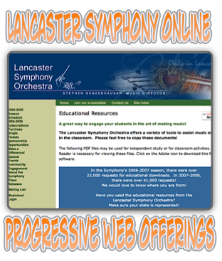
I was pleasantly surprised a few days ago during a session of browsing when I stumbled upon the Lancaster Symphony’s site. It’s chock full of cool articles, study guide, materials, and much more. I’m not sure exactly why they’ve decided to offer up all this great content, but it’s a shining example of what an orchestra website can do to be more helpful to patrons, offer materials to educate audience members, and provide an excellent educational resource for students–the next generation of classical music lovers, right?
Here’s a small sampling of what their site offers–check out much more here:
* Rehearsal Etiquette
* Stand Etiquette
* Concertmaster Responsibilities
* Principal Player Responsibilities
Study Guide Materials
Families of the Orchestra
History of Music Timeline
Music Notation
Music Worksheets
Activities for Young Musicians
click for even more resources from the Lancaster Symphony
Bass News Right To Your Inbox!
Subscribe to get our weekly newsletter covering the double bass world.

As a former professional classical musician turned web developer, I can say that I wholeheartedly agree. Most orchestra websites are painful to look at and to use, and are weak on content at best. Really – this is almost 2009 here and often the orchestra websphere seem like they were designed ten years ago and forgotten. As a web standards evangelist, it is even more frightening to think about for me… 😯